Give It Some ‘Oomph’; How We Helped Position PROH20 As A Leader In The Protein Water Market With A Brand & Packaging Refresh.
Client:PROH20
Deliverables:Brand Identity
Packaging
-
PROH20 makes taking protein easy with a range of tasty on-the-go protein drinks. After a few years in market the company had secured significant investment and was looking to take their brand to the next level.
We partnered with PROH20 to revitalise their branding and packaging, and to help position the brand as a leader in the competitive protein market.
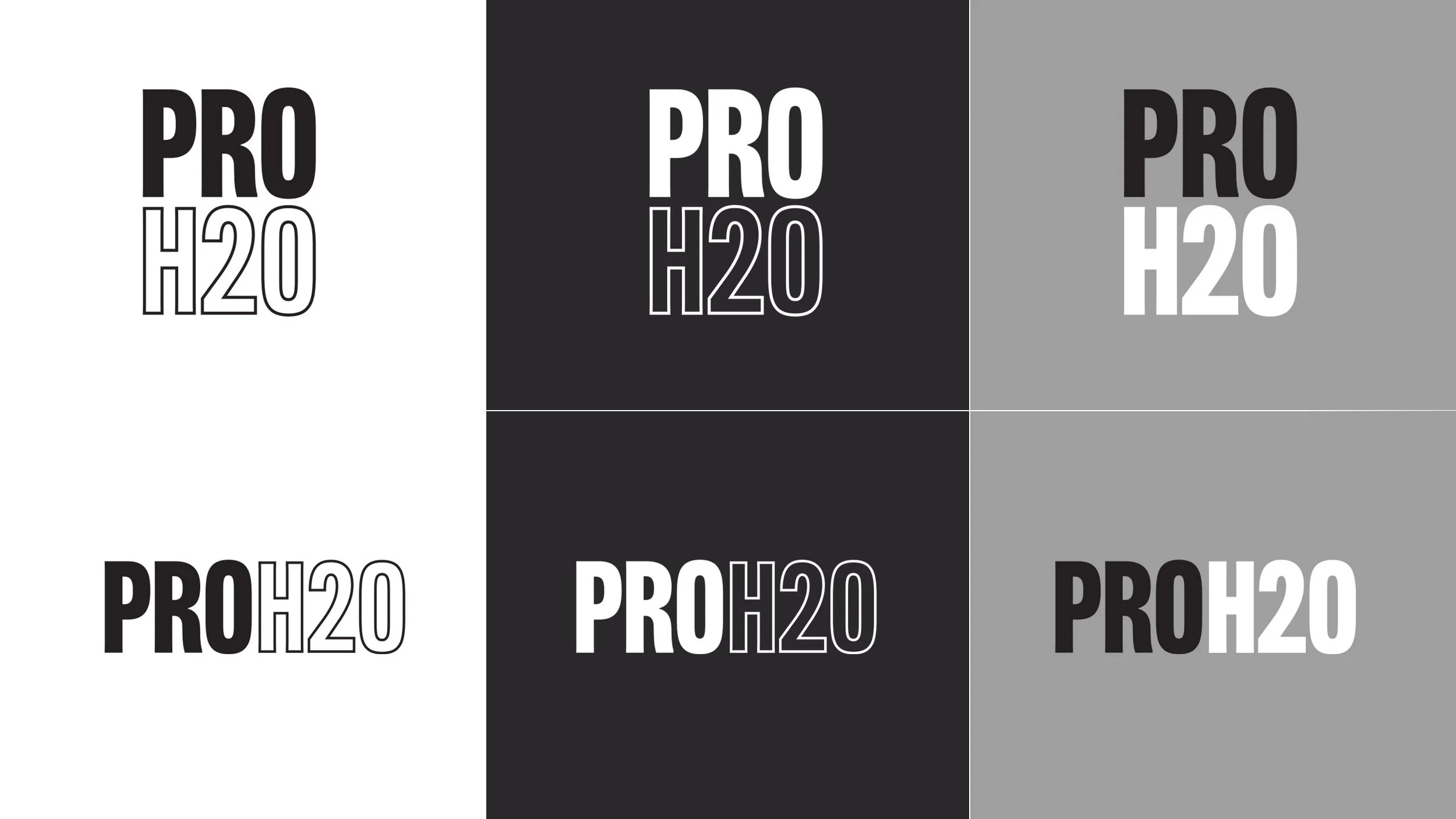
The previous logo lacked the versatility to be implemented effectively across crucial touch-points such as the packaging.
Our new logo was designed to pack a punch. The compact letterforms created a stronger lockup and improved legibility, and a versatile suite of both stacked and horizontal versions ensured any branding opportunity could be capitalised on.
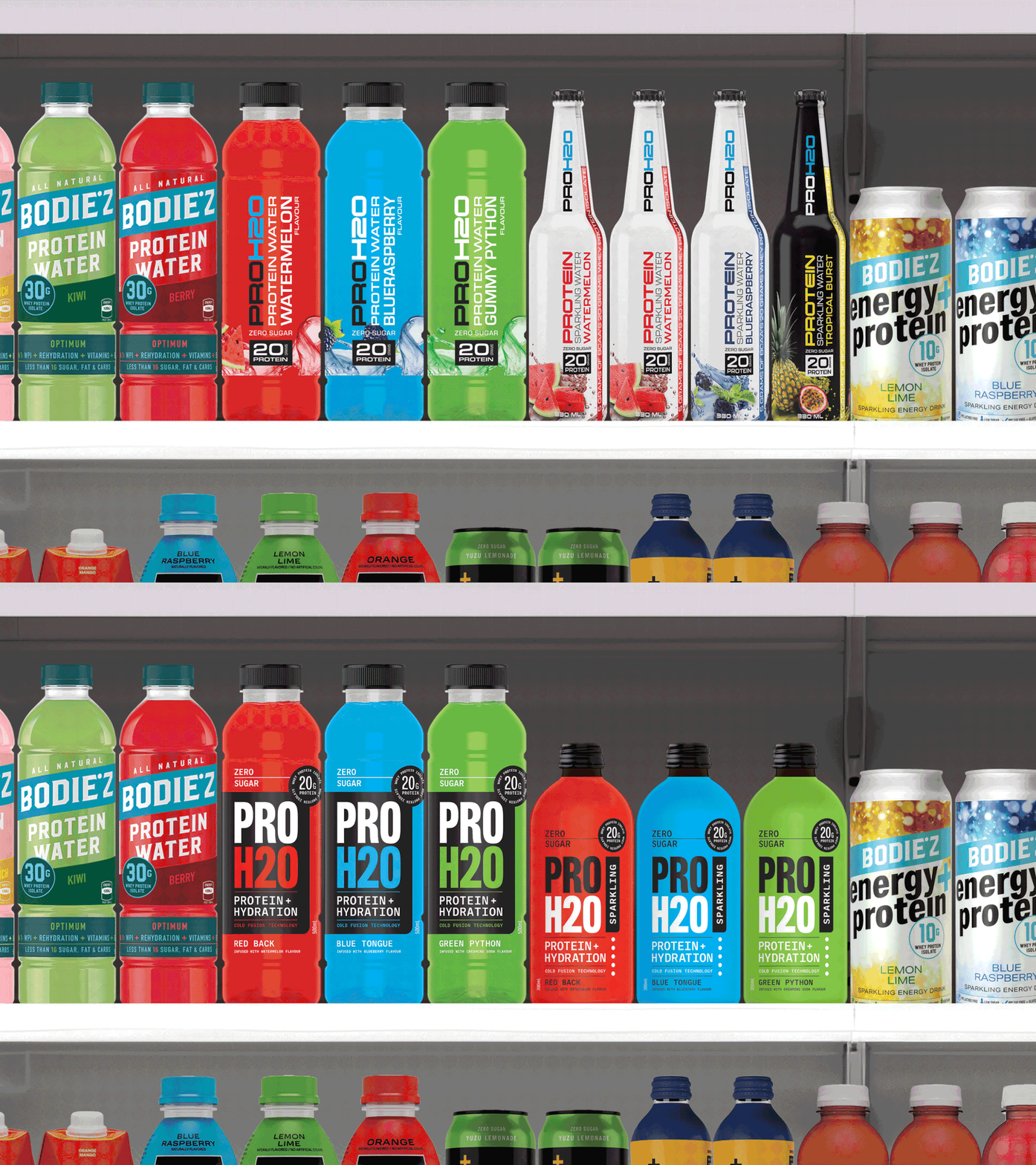
The previous packaging was busy and overcomplicated. The logo was getting lost amongst stacks of vertical type and the lack of hierarchy made information difficult to read.
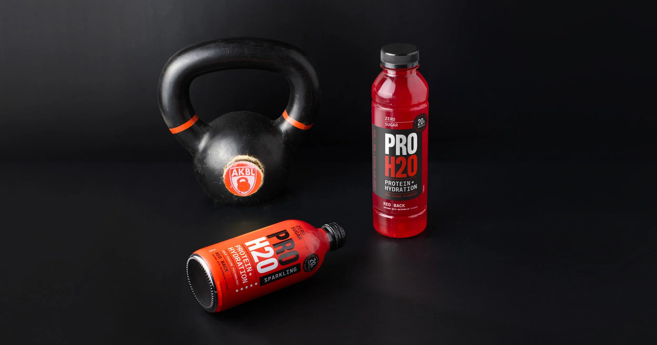
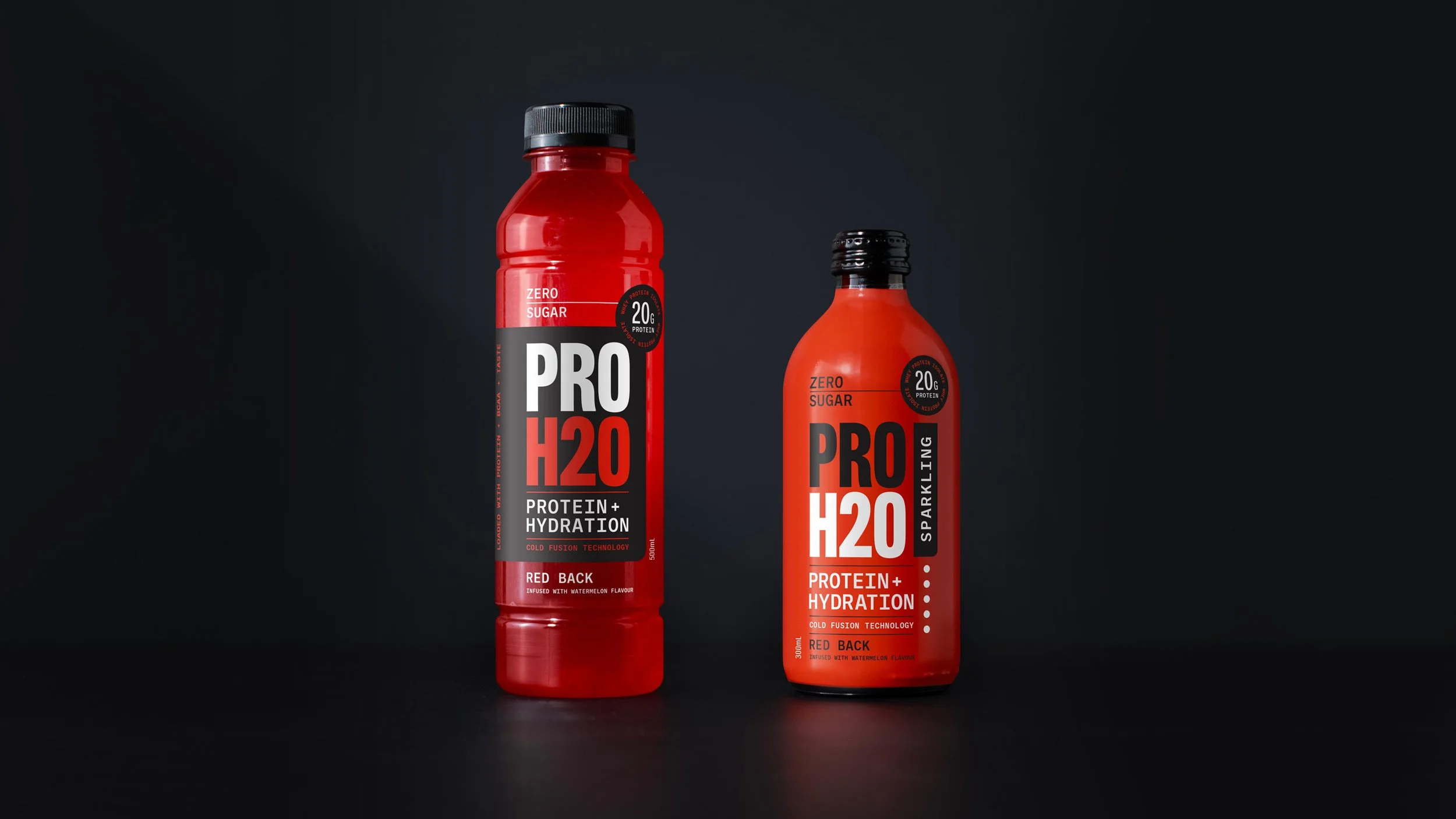
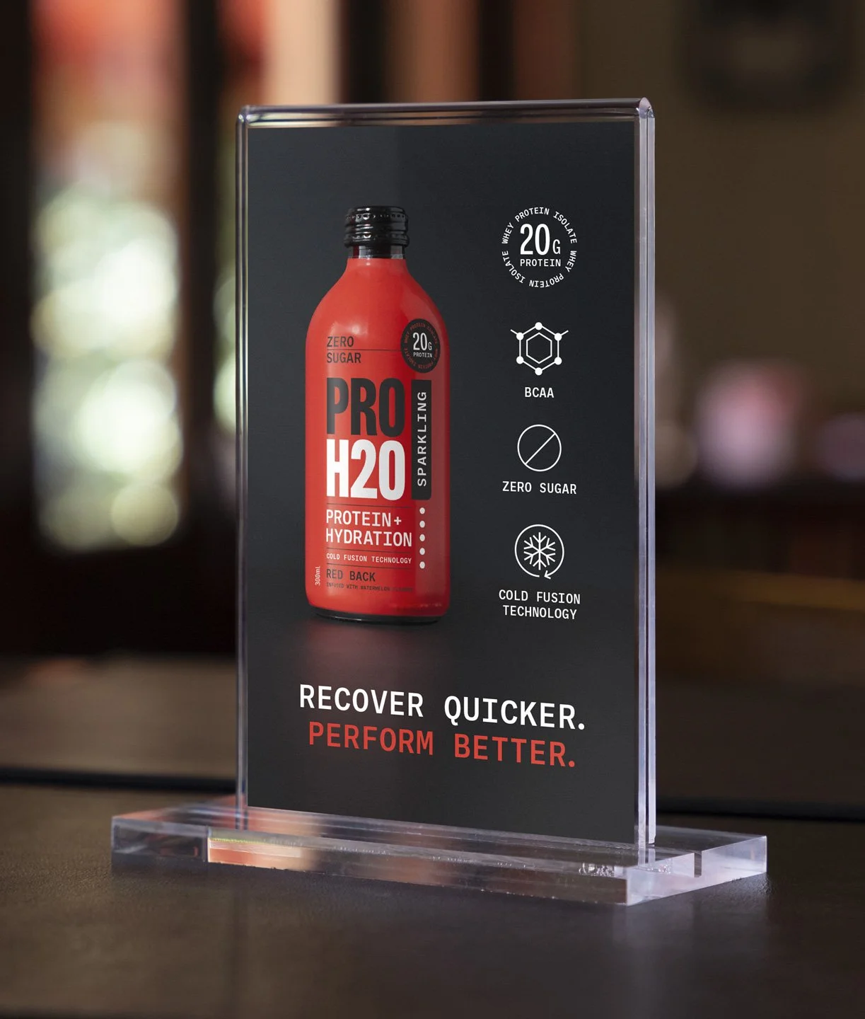
Our new packaging was designed to maximise impact on shelf with stronger branding, clearer call outs and an improved hierarchy of information.
The sparkling range utilised a slightly different colour combination and logo lockup to help differentiate between the ranges whilst still keeping a consistent overall look that is unmistakably PROH20.
The effectiveness of the redesign was most notable on shelf, with the new branding and packaging demanding consumer attention.
Got A Project In Mind? Not Too Sure Where To Start?
Book a free consultation and we will talk through what you need and how we can best help.


